Plotting Functions in “hyperSpec”
Claudia Beleites1,2,3,4,5, Vilmantas Gegzna
- DIA Raman Spectroscopy Group, University of Trieste/Italy (2005–2008)
- Spectroscopy \(\cdot\) Imaging, IPHT, Jena/Germany (2008–2017)
- ÖPV, JKI, Berlin/Germany (2017–2019)
- Arbeitskreis Lebensmittelmikrobiologie und Biotechnologie, Hamburg University, Hamburg/Germany (2019 – 2020)
- Chemometric Consulting and Chemometrix GmbH, Wölfersheim/Germany (since 2016)
chemometrie@beleites.de
2024-03-07
Source:vignettes/plotting.Rmd
plotting.Rmd#> tweaking rglSuggested Packages and Setup
Reproducing the examples in this vignette.
All spectra used in this manual are installed automatically with package hyperSpec.
Terminology Throughout the documentation of the package, the following terms are used:
- wavelength indicates any type of spectral abscissa.
- intensity indicates any type of spectral ordinate.
- extra data indicates non-spectroscopic data.
Preliminary Calculations
For some plots of the faux_cell dataset, the pre-processed spectra and their cluster averages \(\pm\) one standard deviation are more suitable:
set.seed(1)
faux_cell <- generate_faux_cell()

faux_cell_preproc <- faux_cell - spc_fit_poly_below(faux_cell)
faux_cell_preproc <- faux_cell_preproc / rowMeans(faux_cell)
faux_cell_preproc <- faux_cell_preproc - quantile(faux_cell_preproc, 0.05)

cluster_cols <- c("dark blue", "orange", "#C02020")
cluster_meansd <- aggregate(faux_cell_preproc, faux_cell$region, mean_pm_sd)
cluster_means <- aggregate(faux_cell_preproc, faux_cell$region, mean)
1 Predefined Functions
Package hyperSpec comes with 6 major predefined plotting functions:
plot()- main switchyard for most plotting tasks. More details in section 2.
plot_spc()- plots spectra. More details in sections 1.1, 2.1, and 3.
plot_c()-
calibration plot, time series, depth profile.
More details in sections 1.3, 2.5, 2.6, 2.7, and 4.
(
plot_c()is a package lattice function) levelplot()-
package hyperSpec has a method for package lattice[1,2] function
levelplot(). More details in sections 1.4, and 5. plot_matrix()- plots the spectra matrix. More details in sections 1.2, 2.8, and 6.
plot_map()-
more specialized version of
levelplot()for map or image plots. More details in sections 1.5, 2.9, and 7. (plot_map()is a package lattice function) plot_voronoi()-
more specialized version of
plot_map()that produces Voronoi tesselations. More details in sections 1.6, and 2.10. (plot_voronoi()is a package lattice function)
NOTE. Functions plot_map(), plot_voronoi(), and
levelplot()
are package lattice functions. Therefore, in loops,
functions, R Markdown chunks, etc. lattice objects need to be printed
explicitly by, e.g., print(plot_map(object))
(R
FAQ: Why do lattice/trellis graphics not work?).
1.1 Function plot_spc()
Function plot_spc() plots the spectra (Fig. 1.1), i.e., the intensities ($spc) over the wavelengths (@wavelength).
plot_spc(flu)
Figure 1.1: Spectra in dataset flu.
1.2 Function plot_matrix()
Function plot_matrix() plots the spectra, i.e., the colour coded intensities ($spc) over the wavelengths (@wavelength) and the row number (Fig. 1.2).
plot_matrix(flu)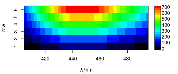
Figure 1.2: Matrix of spectra: the colour coded intensities over the wavelengths and the row number.
1.3 Function plot_c()
Function plot_c() plots an intensity over a single other data column, e.g., concentration (calibration plot, e.g., Fig. 1.3), depth (depth profile plot), or time (time series plot).
plot_c(flu)
#> Warning in plot_c(flu): Intensity at first wavelengh only is used.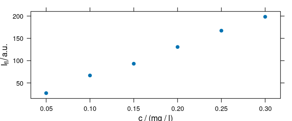
Figure 1.3: Calibration plot: an intensity over concentration.
The following warning is expected:
Intensity at first wavelengh only is used.
1.4 Function levelplot()
Function levelplot() plots a false colour map, defined by a formula (Fig. 5.1).
levelplot(spc ~ x * y, faux_cell[, , 1200], aspect = "iso")
Figure 1.4: False colour map (1).
The following warning is expected:
Only first wavelength is used for plotting.
1.5 Function plot_map()
Function plot_map() is a specialized version of levelplot().
It uses a single value (e.g., average intensity or cluster membership) over two data columns (default are $x and $y) to plot a false colour map (Fig. @ref(fig:plot_map)).
plot_map(faux_cell[, , 1200])
(#fig:plot_map)False colour map created with plot_map().
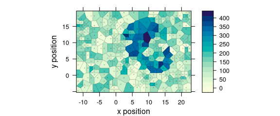
1.6 Function plot_voronoi()
Function plot_voronoi() is a special version of plot_map() that produces Voronoi diagram of the hyperSpec object (Fig. 1.5).
plot_voronoi(sample(faux_cell, 300), region ~ x * y)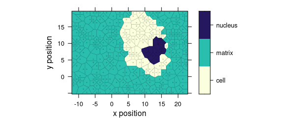
Figure 1.5: Voronoi diagram: an example with faux_cell dataset.
2 Arguments for plot()
The hyperSpec’s plot() method uses its second argument to determine which of the specialized plots to produce.
This allows some handy abbreviations.
All further arguments are handed over to the function actually producing the plot.
2.1 Argument "spc"
Command plot(x, "spc") is equivalent to plot_spc(flu) (Fig. 2.1).
plot(flu, "spc")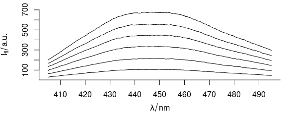
Figure 2.1: All spectra of dataset flu.
2.2 Argument "spcmeansd"
Command plot(x, "spcmeansd") plots mean spectrum \(\pm\) 1 standard deviation (Fig. 2.2).
plot(faux_cell_preproc, "spcmeansd")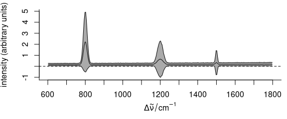
Figure 2.2: Summary spectra: mean \(\pm\) one standard deviation at each wavelength (wavenumber).
2.3 Argument "spcprctile"
Code plot(x, "spcprctile") plots median, 16th and 84th percentile for each wavelength (Fig. 2.3).
For Gaussian distributed data, 16th, 50th and 84th percentile are equal to mean \(\pm\) standard deviation.
Spectroscopic data frequently are not Gaussian distributed.
The percentiles give a better idea of the true distribution.
They are also less sensitive to outliers.
plot(faux_cell_preproc, "spcprctile")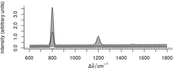
Figure 2.3: Summary spectra: median, 16th and 84th percentiles at each wavelength (wavenumber).
2.4 Argument "spcprctl5"
The code plot(x, "spcprctl5") is like "spcprctile" plus 5th and 95th percentile (Fig. 2.4).
plot(faux_cell_preproc, "spcprctl5")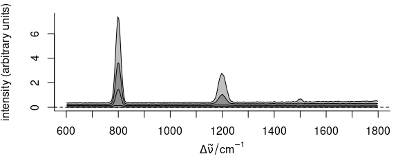
Figure 2.4: Summary spectra: median, 5th, 16th, 84th, 95th percentiles at each wavelength (wavenumber).
2.5 Argument "c"
Command plot(x, "c") is equivalent to plot_c(flu) (Fig. 2.5).
plot(flu, "c")
#> Warning in plot_c(x, ...): Intensity at first wavelengh only is used.
Figure 2.5: Calibration plot: spectra intensities over concentration.
2.6 Argument "ts"
Function plot(x, "ts") plots a time series plot and is equivalent to plot_c(laser, spc ~ t) (Fig. 2.6).
plot(laser[, , 405], "ts")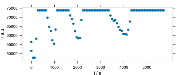
Figure 2.6: Time series plot: spectra intensities over time.
2.7 Argument "depth"
Code plot(x, "depth") plots a depth profile plot and is the same as plot_c(laser, spc ~ z) (Fig. 2.7).
depth.profile <- new("hyperSpec",
  spc = as.matrix(rnorm(20) + 1:20),
  data = data.frame(z = 1:20),
  labels = list(
    spc = "I / a.u.",
    z = expression(`/`(z, mu * m)),
    .wavelength = expression(lambda)
  )
)

plot(depth.profile, "depth")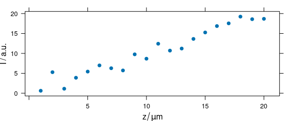
Figure 2.7: Depth profile plot.
2.8 Argument "mat"
Code plot(x, "mat") plots the spectra matrix (Fig. ??).
plot(laser, "mat")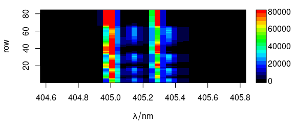
(#fig:plot_matrix)Spectra matrix.
The code is equivalent to:
plot_matrix(laser)A lattice alternative is:
levelplot(spc ~ .wavelength * .row, data = laser)
2.9 Argument "map"
Code plot(x, "map") is equivalent to plot_map(faux_cell) (Fig. 2.8).
plot(faux_cell[, , 1200], "map")
Figure 2.8: False color map: alternative R syntax.
2.10 Argument "voronoi"
Use plot(x, "voronoi") for a Voronoi plot (Fig. @ref(fig:plot_voronoi)).
(#fig:plot_voronoi)Voronoi plot: alternative R syntax.
See ?plot_voronoi and ?latticeExtra::panel.voronoi.
3 Customized Plots of Spectra: plot_spc()
Function plot_spc() offers a variety of parameters for customized plots.
3.1 Plot Particular Wavelength Range
If only one wavelength range is needed (Fig. 3.1), the extract command is handiest.
plot_spc(paracetamol[, , 700 ~ 1200])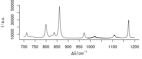
Figure 3.1: Plot of wavelength (wavenumber) range from 700 to 1200 \(cm^{-1}.\)
Numbers connected with the tilde (~) are interpreted as having the same units as the wavelengths.
If wl.range already contains indices use wl.index = TRUE.
For more details refer to vignette("hyperspec", package = "hyperSpec").
3.2 Plot Several Wavelength Ranges
To plot severel wavelength ranges (Fig. 3.2), use wl.range = list (600 ~ 1800, 2800 ~ 3100).
Cut the wavelength axis appropriately with xoffset = 750.
If available, the package package plotrix[3,4] is used to produce the cut mark.
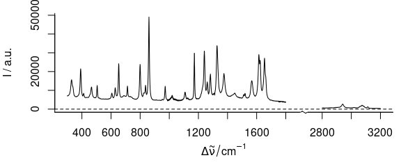
Figure 3.2: Plot of several wavelength (wavenumber) ranges.
3.3 Plot with Reversed Abscissa
To create a plot with reversed abscissa (Fig. 3.3), use wl.reverse = TRUE
plot_spc(paracetamol, wl.reverse = TRUE)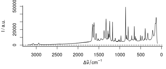
Figure 3.3: Plot with reversed/descending wavelength (wavenumber) range.
3.4 Plot in Different Colours
To have different colours of spectra (Fig. 3.4), use col = vector_of_colours.
plot_spc(flu, col = palette_matlab_dark(6))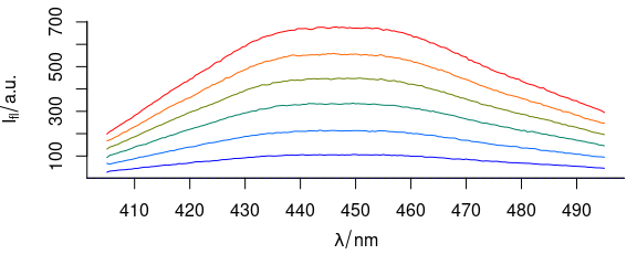
Figure 3.4: Spectra plotted in different colours.
3.5 Plot Dots Instead of Lines
To plot dots instead of lines (Fig. 3.5), use, e.g., lines.args = list (pch = 20, type = "p")
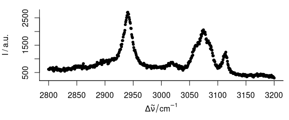
Figure 3.5: Spectrum with dots instead of lines.
3.6 Plot Mass Spectra
TO plot mass spectra (Fig. 3.6), use lines.args = list(type = "h")
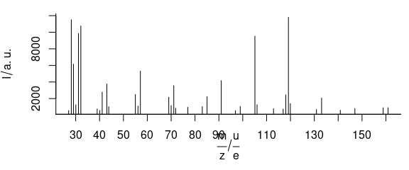
Figure 3.6: An example of mass spectrum.
3.7 Add More Spectra into an Existing Plot
To plot additional spectra onto an existing plot (Fig. 3.7), use add = TRUE
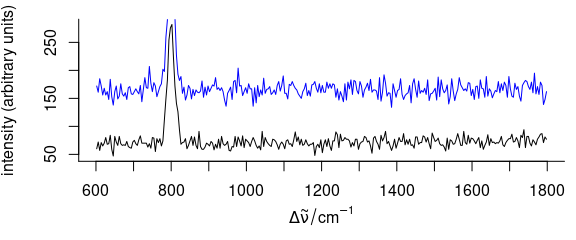
Figure 3.7: A spectrum added to an existing plot.
3.8 Plot Summary Characteristics
Argument func may be used to calculate summary characteristics before plotting.
To plot, e.g., the standard deviation of the spectra, use plot_spc(..., func = sd) (Fig. 3.8).
plot_spc(faux_cell_preproc, func = sd)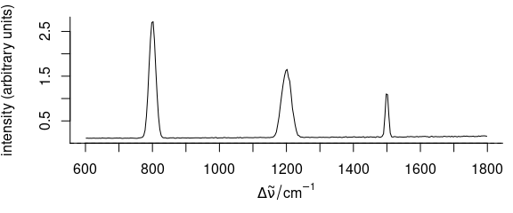
Figure 3.8: A spectrum of summary statistics calculated via func parameter.
In the example, the standard deviation is used.
3.9 Plot Different Line at \(I = 0\)
To plot a different line at zero intensity \((I = 0)\), argument zeroline may be used (Fig. 3.9).
Argument zeroline takes a list with parameters that are passed to function abline(), NA suppresses the line.
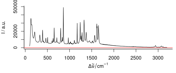
Figure 3.9: Spectrum with added zero-intensity line.
3.10 Adding Annotations to a Spectra Plot
Function plot_spc() uses base graphics.
After plotting the spectra, more content may be added to the graphic by abline(), lines(), points(), etc. (Fig. 3.10).
plot(laser, "spcmeansd")
abline(
  v = c(405.0063, 405.1121, 405.2885, 405.3591),
  col = c("black", "blue", "red", "darkgreen")
)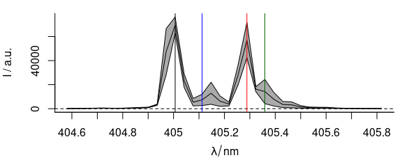
Figure 3.10: A summary spectrum with annotation lines.
3.11 Stacked Spectra
3.11.1 Simple Stacking
To stack spectra, use stacked = TRUE (Fig. 3.11).
plot_spc(
  cluster_means,
  col = cluster_cols,
  stacked = TRUE
)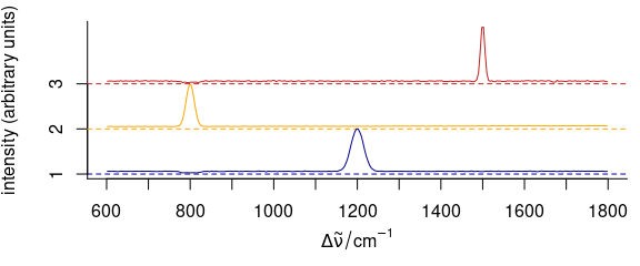
Figure 3.11: Stacked spectra of means.
3.11.2 Stacking Groups of Spectra
The spectra to be stacked can be grouped: stacked = "factor".
Alternatively, the name of an extra data column can be used for grouping (Fig. 3.12).
op <- par(las = 1, mgp = c(3.1, .7, 0))

plot(
  cluster_meansd,
  stacked = ".aggregate",
  fill    = ".aggregate",
  col     = cluster_cols
)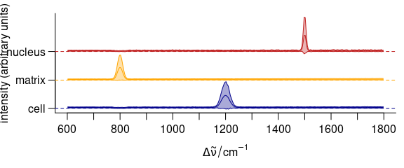
Figure 3.12: Stacked summary spectra (mean \(\pm\) one standard deviation).
3.11.3 Manually Giving yoffset
Stacking values can also be given manually as numeric values in yoffset (Fig. 3.13).
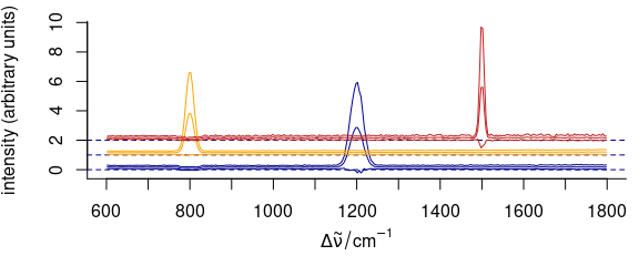
Figure 3.13: Stacked spectra with customized y offset.
3.11.4 Dense Stacking
It is possible to obtain a denser stacking (Fig. 3.14).
yoffsets <- apply(cluster_means[[]], 2, diff)
yoffsets <- -apply(yoffsets, 1, min)
plot(cluster_means,
  yoffset = c(0, cumsum(yoffsets)),
  col = cluster_cols
)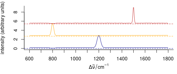
Figure 3.14: Dense-stacked spectra.
3.11.5 Elaborate Example
Function plot_spc() allows fine grained customization of almost all aspects of the plot (see example in Fig. 3.15).
This is possible by giving arguments to the functions that actually perform the plotting plot() for setting up the plot area, lines() for the plotting of the lines, axis() for the axes, etc.
The arguments for these functions should be given in lists as plot.args, lines.args, axis.args, etc.
yoffset <- apply(faux_cell_preproc, 2, quantile, c(0.05, 0.95))
yoffset <- range(yoffset)
plot(faux_cell_preproc[1],
  plot.args = list(ylim = c(0, 2) * yoffset),
  lines.args = list(type = "n")
)
yoffset <- (0:1) * diff(yoffset)
for (i in 1:3) {
  plot(faux_cell_preproc, "spcprctl5",
    yoffset = yoffset[i],
    col = "gray", add = TRUE
  )
  plot(faux_cell_preproc[i],
    yoffset = yoffset[i],
    col = palette_matlab_dark(3)[i], add = TRUE,
    lines.args = list(lwd = 2)
  )
}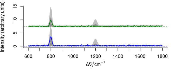
Figure 3.15: An example of highly customized spectra.
4 Calibration, (Depth) Profile, and Time Series Plots: plot_c()
4.1 Intensities over Concentration
Spectra intensities of one wavelength can be plotted over the concentration for univariate calibration (Fig. 4.1).
plot_c(flu[, , 450])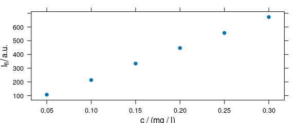
Figure 4.1: Intensities at 450 nm over concentration.
The default is to use the first intensity only.
4.2 Summary Intensities over Concentration
A function to compute a summary of the intensities before the drawing can be used via argument func (Fig. 4.2).
plot_c(flu, func = range, groups = .wavelength)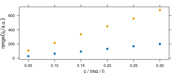
Figure 4.2: The summary (minimum and maximum) of intensities at each measured concentration.
If func() returns more than one value, the different results are accessible by .wavelength.
4.3 Conditioning: Plotting More Traces Separately
Lattice conditioning (operator |) can be used to plot more traces separately (Fig. 4.3).
plot_c(flu[, , c(405, 445)], spc ~ c | .wavelength,
  cex = .3, scales = list(alternating = c(1, 1))
)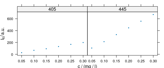
Figure 4.3: Conditioning: several calibration spectra on separate subplots.
4.4 Grouping: Plot More Traces in One Panel
Argument groups may be used as a grouping parameter to plot more traces in one panel (Fig. 4.4).
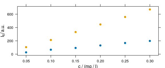
Figure 4.4: Grouping: several calibration spectra on one plot.
4.5 Changing Axis Labels (and Other Parameters)
Arguments of lattice function xyplot() can be given to plot_c() (Fig. 4.5).
plot_c(flu[, , 450],
  ylab = expression(I["450 nm"] / a.u.),
  xlim = range(0, flu$c + .01),
  ylim = range(0, flu$spc + 10),
  pch = 4
)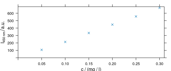
Figure 4.5: Modified axis labels and point characters.
4.6 Adding Things to the Plot: Customized Panel Function
As plot_c() uses the package lattice function xyplot(), additions to the plot must be made via the panel function (Fig. 4.6).
panelcalibration <- function(x, y, ..., clim = range(x), level = .95) {
  panel.xyplot(x, y, ...)
  lm <- lm(y ~ x)
  panel.abline(coef(lm), ...)
  cx <- seq(clim[1], clim[2], length.out = 50)
  cy <- predict(lm, data.frame(x = cx),
    interval = "confidence",
    level = level
  )
  panel.lines(cx, cy[, 2], col = "gray")
  panel.lines(cx, cy[, 3], col = "gray")
}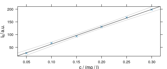
Figure 4.6: Plot that uses a customized paanel function.
4.7 Time Series and Other Plots of the Type “Intensity-over-Something”
Abscissae other than c may be specified by explicitly giving the model formula (Fig. 4.7).
plot_c(laser[, , c(405.0063, 405.1121, 405.2885, 405.3591)],
  spc ~ t,
  groups = .wavelength,
  type   = "b",
  col    = c("black", "blue", "red", "darkgreen")
)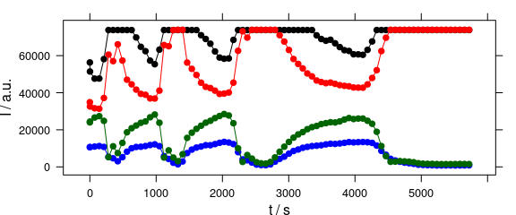
Figure 4.7: Plot with abscissae explicitly indicated by model formula.
5 Levelplot: levelplot()
Package hyperSpec’s function levelplot() can use two special column names:
- .wavelength for the wavelengths,
- .row for the row index (i.e., spectrum number) in the data.
Besides that, it behaves exactly like lattice levelplot().
Particularly, the data is given as the second argument (Fig. 5.1).
levelplot(spc ~ x * y, data = faux_cell[, , 800])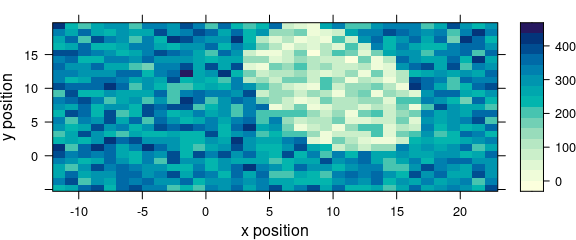
Figure 5.1: An example of a levelplot.
If the colour-coded value is a factor, the display is adjusted to this fact (Fig. 5.2).
levelplot(region ~ x * y, data = faux_cell)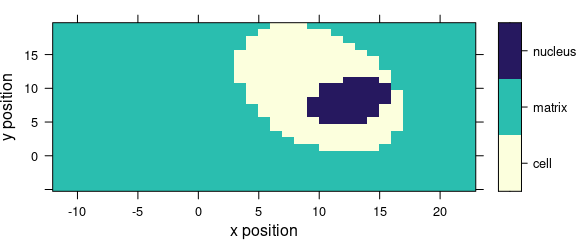
Figure 5.2: Levelplot when colour-coded value is a factor.
6 Spectra Matrix: plot_matrix()
It is often useful to plot the spectra against an additional coordinate, e.g., the time for time
series, the depth for depth profiles, etc.
This can be done by plot(object, "mat").
The actual plotting is done by image(), but levelplot() can produce spectra matrix plots as well and these plots can be grouped or conditioned.
6.1 Different Palette
Argument col can be used to provide a different colour palette (Fig. 6.1).
plot(laser, "mat", col = heat.colors(20))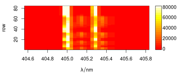
Figure 6.1: Spectra matrix with non-default palette.
This is the same as:
plot_matrix(laser, col = heat.colors(20))6.2 Different Y-Axis
Different extra data column can be used as y-axis (Fig. 6.2).
plot_matrix(laser, y = "t")
Figure 6.2: Spectra matrix with time (in column t) on y axis.
Alternatively, y values and axis label can be given separately.
plot_matrix(laser, y = laser$t, ylab = labels(laser, "t"))6.3 Contour Lines
Contour lines may also be added (Fig. 6.3).
plot_matrix(flu, col = palette_matlab_dark(20))
plot_matrix(flu, col = "white", contour = TRUE, add = TRUE)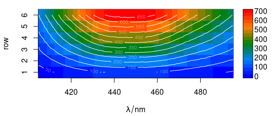
Figure 6.3: Spectra matrix with added contour lines.
6.4 Colour-Coded Points: Special Panel Function
In levelplot(), colour-coded points may be set via special panel function (Fig. 6.4).
library("latticeExtra")

barb <- collapse(barbiturates)
barb <- wl_sort(barb)
levelplot(spc ~ .wavelength * z, barb,
  panel = panel.levelplot.points,
  cex = .33, col.symbol = NA,
  col.regions = palette_matlab
)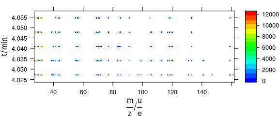
Figure 6.4: Colour-coded points via special panel function.
7 False-Colour Maps: plot_map()
7.1 Plotting map
Function plot_map() is a specialized version of levelplot() (Fig. 7.3).
The spectral intensities may be summarized by a function before plotting (default: mean()).
The same scale is used for x and y axes (aspect = "iso").
plot_map(faux_cell[, , 1200])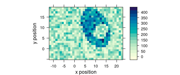
Figure 7.1: An example of a false colour map.
7.2 Plotting Maps with Manually Specified X and Y Axes
Specify the colour-coded variable, abscissa and ordinate as formula: colour.coded ~ abscissa * ordinate (Fig. 7.2).
plot_map(faux_cell[, , 1200], spc ~ y * x)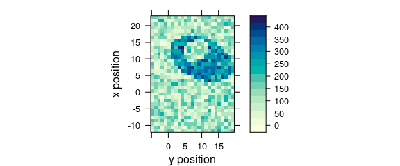
Figure 7.2: False colour map with an explicit specification of x and y axes.
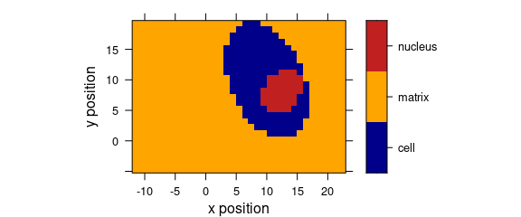
7.3 Discrete Colours
Factor variables may be used for discrete colour coding (Fig. 7.3).
plot_map(faux_cell, region ~ x * y)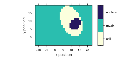
Figure 7.3: False colour map with colours defined by a factor variable.
If the colour-coded variable is a factor, each level gets its own colour, and the legend is labelled accordingly.
8 Fine-Tuning lattice Parameters
The plotting of colour maps is done via R package lattice (aka Trellis graphic approach), which is highly customizable.
Use function trellis.par.get() and trellis.par.set() to get/set the settings for the current graphics device.
my_theme <- trellis.par.get()
names(my_theme) # note how many parameters are tunable
#>  [1] "grid.pars"         "fontsize"          "background"        "panel.background"
#>  [5] "clip"              "add.line"          "add.text"          "plot.polygon"
#>  [9] "box.dot"           "box.rectangle"     "box.umbrella"      "dot.line"
#> [13] "dot.symbol"        "plot.line"         "plot.symbol"       "reference.line"
#> [17] "strip.background"  "strip.shingle"     "strip.border"      "superpose.line"
#> [21] "superpose.symbol"  "superpose.polygon" "regions"           "shade.colors"
#> [25] "axis.line"         "axis.text"         "axis.components"   "layout.heights"
#> [29] "layout.widths"     "box.3d"            "par.title.text"    "par.xlab.text"
#> [33] "par.ylab.text"     "par.zlab.text"     "par.main.text"     "par.sub.text"
Any of these parameters can be fine-tuned to produce the desired output.
For example, parameter my_theme$region is responsible for the appearance of color maps, and it contains elements $alpha and $col.
By changing these parameters you can create your own theme for plotting and pass it to the plotting function via par.settings.
8.1 Changed Palette
Fig. 8.1 uses a customized lattice theme.
my_theme$regions$col <- grDevices::terrain.colors
plot_map(faux_cell[, , 1200], par.settings = my_theme)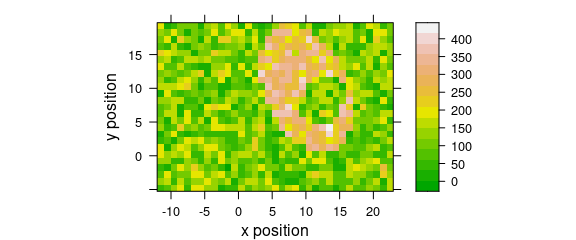
Figure 8.1: A false-colour map that uses terrain.colors palette.
It is possible to persistently (i.e. inside of the current R session) set lattice parameters, so they would apply to all further plots.
This is done via a call to trellis.par.set(), for example trellis.par.set(my_theme).
The current settings can be visualized via a call to show.settings()
8.2 Show Current lattice Settings
Graphical parameters for trellis may be displayed via show.settings() (Fig. 8.2).
# Display current trellis parameters
show.settings()
show.settings(my_theme)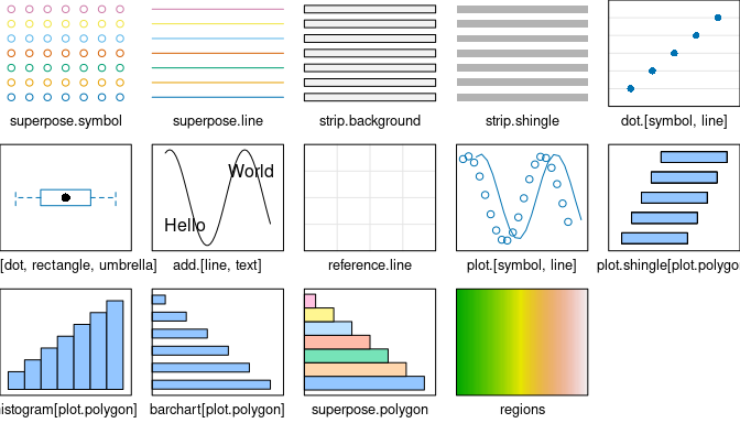
Figure 8.2: Show lattice settings.
An overview of different colour palettes, and ways to create your own, can be found in the R colour cheatsheet.
8.3 Defined Wavelengths
A map of the average intensity at particular wavelengths can be plotted if the wavelengths of interested are explicitly extracted (Fig. 8.3).
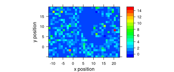
Figure 8.3: A map of average intensity at explicitly indicated wavelengths.
8.4 Conditioning
Logical conditions may be used to create subplots (Fig. 8.4).
plot_map(
  faux_cell[, , 1500],
  spc ~ y * x | x > 5,
  col.regions = palette_matlab(20)
)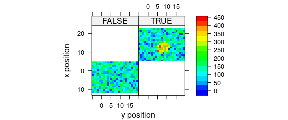
Figure 8.4: Subplots created by logical conditions.
8.5 Conditioning on .wavelength
Function plot_map() automatically applies the function in func before plotting.
Argument func defaults to function mean().
In order to suppress this, use func = NULL.
This allows conditioning on the wavelengths.
Fig. 8.5 demonstrates an example to plot the maps of principal components scores.
pca <- prcomp(~spc, data = faux_cell_preproc$.)

scores <- decomposition(faux_cell, pca$x,
  label.wavelength = "PC",
  label.spc = "score /  a.u."
)

plot_map(
  scores[, , 1:3],
  spc ~ y * x | as.factor(.wavelength),
  func = NULL,
  col.regions = palette_matlab(20)
)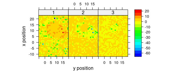
Figure 8.5: The maps of the scores of the first two principal components (I).
Alternatively, use levelplot() directly (Fig. 8.6).
levelplot(
  spc ~ y * x | as.factor(.wavelength),
  scores[, , 1:3],
  aspect = "iso",
  col.regions = palette_matlab(20)
)
Figure 8.6: The maps of the scores of the first two principal components (II).
8.6 Voronoi Plot
Fig. 8.7 shows an example of a Voronoi plot.
Voronoi uses panel.voronoi() from package latticeExtra[5].
plot_voronoi(
  sample(faux_cell, 300), region ~ x * y,
  col.regions = palette_matlab(20)
)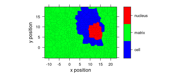
Figure 8.7: Voronoi plot that uses non-default discrette colour palette.
8.7 Mark Missing Spectra
If the spectra come from a rectangular grid, missing positions can be marked with the following panel function:
mark.missing <- function(x, y, z, ...) {
  panel.levelplot(x, y, z, ...)

  miss <- expand.grid(x = unique(x), y = unique(y))
  miss <- merge(miss, data.frame(x, y, TRUE), all.x = TRUE)
  miss <- miss[is.na(miss[, 3]), ]
  panel.xyplot(miss[, 1], miss[, 2], pch = 4, ...)
}
Fig. 8.8 shows the result.
plot_map(sample(faux_cell[, , 1200], length(faux_cell) - 20),
  col.regions = palette_matlab(20),
  col = "black",
  panel = mark.missing
)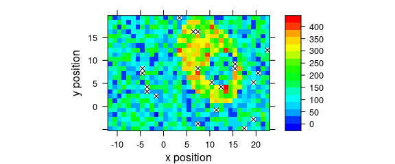
Figure 8.8: Marks of missing spectra in a false-colour map.
8.8 Unevenly Spaced Measurement Grid
The panel function used by plot_map() defaults to panel.levelplot.raster() which assumes an evenly spaced measurement grid.
Even if the spectra are measured on a nominally evenly spaced grid, the actual stage position may slightly vary due to positioning inaccuracy and some manufacturers (e.g., Kaiser) record the position reported by the stage rather than the position requested by the stage control.
This leads to weird-looking output with holes, and possibly wrong columns (Fig. 8.9).
uneven <- faux_cell[, , 1200]
uneven$x <- uneven$x + round(rnorm(nrow(uneven), sd = 0.05), digits = 1)
uneven$y <- uneven$y + round(rnorm(nrow(uneven), sd = 0.05), digits = 1)
plot_map(uneven)
#> Warning in (function (x, y, z, subscripts, at = pretty(z), ..., col.regions = regions$col, : 'x'
#> values are not equispaced; output may be wrong
#> Warning in (function (x, y, z, subscripts, at = pretty(z), ..., col.regions = regions$col, : 'y'
#> values are not equispaced; output may be wrong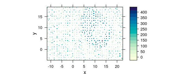
Figure 8.9: Unevenly spaced measurement grid: example I.
Note warnings values are not equispaced; output may be wrong.
The symptom of this situation are warnings about values in x and/or y not being equispaced; and that the output, therefore, may be wrong.
One possibility to obtain a correct map is using plot_voronoi() instead which will construct a mosaic-like image with the respective “pixel” areas being centred around the actually recorded $x and $y position (Fig. 8.10).
plot_voronoi(uneven, backend = "deldir")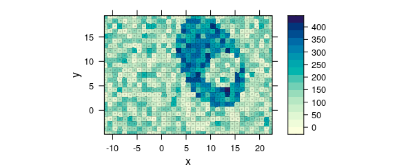
Figure 8.10: Unevenly spaced measurement grid: example II.
Another possibility that underlines a point shape of the measurements is switching to latticeExtra::panel.levelplot.points() (Fig. 8.11).
plot_map(
  uneven,
  panel = panel.levelplot.points,
  cex = 0.75,
  col.symbol = NA
)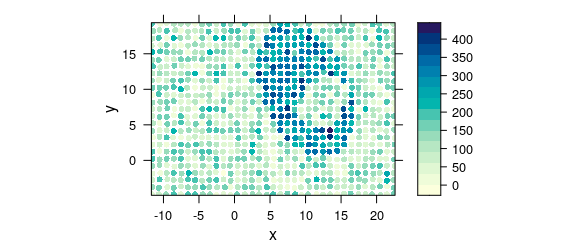
Figure 8.11: Unevenly spaced measurement grid: example III.
Alternatively, the measurement raster positions can be rounded to their nominal raster (e.g. Fig. 8.12).
rx <- raster_make(uneven$x, startx = -11.55, d = 1, tol = 0.3)
uneven$x <- rx$x

ry <- raster_make(uneven$y, startx = -4.77, d = 1, tol = 0.3)
uneven$y <- ry$x

plot_map(uneven)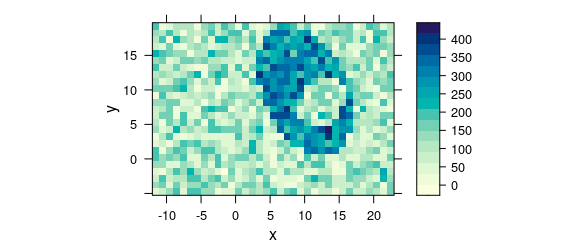
Figure 8.12: Unevenly spaced measurement grid: example IV.
9 3D Plots (with package rgl)
Package rgl[6] offers fast 3d plotting in R. As package rgl’s axis annotations are sometimes awkward, they may better be set manually:
library(rgl)

laser <- laser[, , 404.8 ~ 405.6] / 10000
laser$t <- laser$t / 3600
cols <- rep(palette_matlab(nrow(laser)), nwl(laser))
surface3d(
  y = wl(laser), x = laser$t,
  z = laser$spc, col = cols
)
aspect3d(c(1, 1, 0.25))
axes3d(c("x+-", "y--", "z--"))
axes3d("y--", nticks = 25, labels = FALSE)
mtext3d("t / h", "x+-", line = 2.5)
mtext3d("lambda / nm", "y--", line = 2.5)
mtext3d("I / a.u.", edge = "z--", line = 2.5)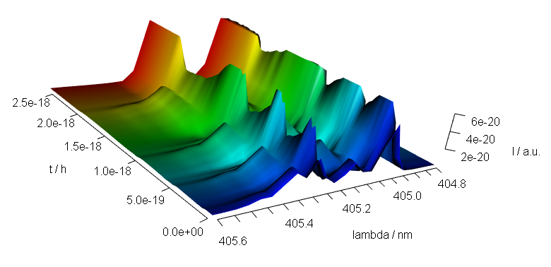
Figure 9.1: A snapshot of an rgl plot.
10 Interactive Graphics
Package hyperSpec offers basic interaction, identify_spc() for spectra plots, and map.identify() and map.sel.poly() for maps.
The first two identify points in spectra plots and map plots, respectively.
Function map.sel.poly() selects the part of a hyperSpec object that lies inside the user defined polygon.
10.1 identify_spc() Finding Out Wavelength, Intensity and Spectrum
Function identify_spc() allows to measure points in graphics produced by plot_spc().
It works correctly with reversed and cut wavelength axes.
identify_spc(plot_spc(paracetamol, wl.range = c(600 ~ 1800, 2800 ~ 3200), xoffset = 800))The result is a data.frame with the indices of the spectra, the wavelength, and its intensity.
10.2 map.identify() finding a spectrum in a map plot
Function map.identify() returns the spectra indices of the clicked points.
map.identify(faux_cell[, , 1200])
10.3 map.sel.poly() selecting spectra inside a polygon in a map plot
Function map.sel.poly() returns a logical indicating which spectra are inside the polygon drawn by the user:
map.sel.poly(faux_cell[, , 1200])10.4 Related Functions Provided by Base Graphics and lattice
For base graphics (as produced by plot_spc()), locator() may be useful as well.
It returns the clicked coordinates. Note that these are not transformed according to xoffset & Co.
For lattice graphics, grid.locator() may be used instead.
If it is not called in the panel function, a preceding call to trellis.focus() is needed:
plot(laser, "mat")
trellis.focus()
grid.locator()
Function identify() (or panel.identify() for lattice graphics) allows to identify points of the plot directly.
Note that the returned indices correspond to the plotted object.
11 Troubleshooting
11.1 No Output Is Produced
Methods plot_map, plot_voronoi, levelplot, and plot_c use package lattice functions.
Therefore, in loops, functions, Sweave, R Markdown chunks, etc. the lattice object needs to be printed explicitly by print(plot_map(object))
(R FAQ: Why do lattice/trellis graphics not work?).
The same holds for package ggplot2 graphics.
Session Info
sessioninfo::session_info("hyperSpec")
#> ─ Session info ───────────────────────────────────────────────────────────────────────────────────
#>  setting  value
#>  version  R version 4.3.3 (2024-02-29)
#>  os       Ubuntu 22.04.4 LTS
#>  system   x86_64, linux-gnu
#>  ui       X11
#>  language en
#>  collate  C.UTF-8
#>  ctype    C.UTF-8
#>  tz       UTC
#>  date     2024-03-07
#>  pandoc   3.1.11 @ /opt/hostedtoolcache/pandoc/3.1.11/x64/ (via rmarkdown)
#>
#> ─ Packages ───────────────────────────────────────────────────────────────────────────────────────
#>  ! package        * version      date (UTC) lib source
#>    brio             1.1.4        2023-12-10 [2] RSPM
#>    callr            3.7.5        2024-02-19 [2] RSPM
#>    cli              3.6.2        2023-12-11 [2] RSPM
#>    colorspace       2.1-0        2023-01-23 [2] RSPM
#>    crayon           1.5.2        2022-09-29 [2] RSPM
#>    deldir           2.0-4        2024-02-28 [2] RSPM
#>    desc             1.4.3        2023-12-10 [2] RSPM
#>    diffobj          0.3.5        2021-10-05 [2] RSPM
#>    digest           0.6.34       2024-01-11 [2] RSPM
#>    dplyr            1.1.4        2023-11-17 [2] RSPM
#>    evaluate         0.23         2023-11-01 [2] RSPM
#>    fansi            1.0.6        2023-12-08 [2] RSPM
#>    farver           2.1.1        2022-07-06 [2] RSPM
#>    fs               1.6.3        2023-07-20 [2] RSPM
#>    generics         0.1.3        2022-07-05 [2] RSPM
#>    ggplot2        * 3.5.0        2024-02-23 [2] RSPM
#>    glue             1.7.0        2024-01-09 [2] RSPM
#>    gtable           0.3.4        2023-08-21 [2] RSPM
#>    hyperSpec      * 0.200.0.9000 2024-03-07 [1] local
#>    hySpc.testthat   0.2.1        2020-06-24 [2] RSPM
#>    interp           1.1-6        2024-01-26 [2] RSPM
#>    isoband          0.2.7        2022-12-20 [2] RSPM
#>    jpeg             0.1-10       2022-11-29 [2] RSPM
#>    jsonlite         1.8.8        2023-12-04 [2] RSPM
#>    labeling         0.4.3        2023-08-29 [2] RSPM
#>    lattice        * 0.22-5       2023-10-24 [4] CRAN (R 4.3.3)
#>    latticeExtra   * 0.6-30       2022-07-04 [2] RSPM
#>    lazyeval         0.2.2        2019-03-15 [2] RSPM
#>    lifecycle        1.0.4        2023-11-07 [2] RSPM
#>    magrittr         2.0.3        2022-03-30 [2] RSPM
#>    MASS             7.3-60.0.1   2024-01-13 [4] CRAN (R 4.3.3)
#>    Matrix           1.6-5        2024-01-11 [4] CRAN (R 4.3.3)
#>    mgcv             1.9-1        2023-12-21 [4] CRAN (R 4.3.3)
#>    munsell          0.5.0        2018-06-12 [2] RSPM
#>    nlme             3.1-164      2023-11-27 [4] CRAN (R 4.3.3)
#>    pillar           1.9.0        2023-03-22 [2] RSPM
#>    pkgbuild         1.4.3        2023-12-10 [2] RSPM
#>    pkgconfig        2.0.3        2019-09-22 [2] RSPM
#>    pkgload          1.3.4        2024-01-16 [2] RSPM
#>    png              0.1-8        2022-11-29 [2] RSPM
#>    praise           1.0.0        2015-08-11 [2] RSPM
#>    processx         3.8.3        2023-12-10 [2] RSPM
#>    ps               1.7.6        2024-01-18 [2] RSPM
#>    R6               2.5.1        2021-08-19 [2] RSPM
#>    RColorBrewer     1.1-3        2022-04-03 [2] RSPM
#>    Rcpp             1.0.12       2024-01-09 [2] RSPM
#>  R RcppEigen        <NA>         <NA>       [?] <NA>
#>    rematch2         2.1.2        2020-05-01 [2] RSPM
#>    rlang            1.1.3        2024-01-10 [2] RSPM
#>    rprojroot        2.0.4        2023-11-05 [2] RSPM
#>    scales           1.3.0        2023-11-28 [2] RSPM
#>    testthat         3.2.1        2023-12-02 [2] RSPM
#>    tibble           3.2.1        2023-03-20 [2] RSPM
#>    tidyselect       1.2.0        2022-10-10 [2] RSPM
#>    utf8             1.2.4        2023-10-22 [2] RSPM
#>    vctrs            0.6.5        2023-12-01 [2] RSPM
#>    viridisLite      0.4.2        2023-05-02 [2] RSPM
#>    waldo            0.5.2        2023-11-02 [2] RSPM
#>    withr            3.0.0        2024-01-16 [2] RSPM
#>    xml2             1.3.6        2023-12-04 [2] RSPM
#>
#>  [1] /tmp/RtmpwJcUHX/temp_libpath18f414eab874
#>  [2] /home/runner/work/_temp/Library
#>  [3] /opt/R/4.3.3/lib/R/site-library
#>  [4] /opt/R/4.3.3/lib/R/library
#>
#>  R ── Package was removed from disk.
#>
#> ──────────────────────────────────────────────────────────────────────────────────────────────────